Business Statistics and Analysis (week 1)31st of December 2016 |
 |
Last MOOC of 2016 (or first of 2017) to catch my eye is this specialization. The first course seems like a bit of an unnecessary rehearsal of the common features of the Excel software, so I launch myself straight into the second course titled “Basic Data Descriptors, Statistical Distributions, and Application to Business Decisions”. Only a four week course, but I hope that it will provide me with a basis on which to develop my nascent data analysis skills. As with the first course, it does require the use of Microsoft Excel to do the exercises and calculations.
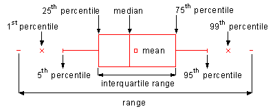
The first week is a general rehearsal of basic statistical methods, starting with a quick recap of descriptive statistics. This field is divided up by the teacher into two flavors: Measures of Central Tendencies (with the mean, median and mode as techniques), and Measures of Dispersion (with range, or more correctly the Inter Quartile Range, as a measure for spread to get a sense of the skewness of the data set). All of these measures can be visually represented using a box plot, which is especially useful for side by side comparison.
The most common measure for dispersion is the standard deviation, which is the average of differences between the values in the data set and it’s mean. This measure can be interpreted using the rule of thumb, stating that 68% of data entries in a set will fall in the range determined by the mean minus the standard deviation and the mean plus the standard deviation. Up to 95% of all entries will fall within a distance of two standard deviations from the mean. However, this rule assumes normal distribution of these entries (in a bell curve or Gaussian function). If the data set does not follow normal distribution, we fall back on the Theorem of Chebyshev, which states that at least (1 -1/k²) percentile of data entries lie in +/- k standard deviations of the mean regardless of shape of distribution.
The box plot (and thus the underlying principle of the Theorem of Chebyshev) can be used to detect outliers in data sets. Frank E. Grubbs gives a proper definition for the concept of outliers in data sets in his article “Procedures for detecting outlying observations in samples” written for Technometrics in 1964.
Translated to our box plot, this means any entry which falls outside of the range determined by the whiskers (vertical lines on the plot – usually the 5th and 95th percentile) is considered to be an outlier. This is easy to determine since box plots are non-parametric, meaning they show variations in a population without taking assumptions on the statistical distributions where probability is determined by mathematical functions (see week 3).
The first week is rather standard stuff and not yet too tantalizing for my tastes. But I guess a rehearsal of known statistics before proceeding forward with the rest of the course is never a bad idea. I wouldn’t mind it picking up the pace a little though. Especially the elaborate demonstrations in Excel seem a bit unnecessary.
Business Statistics and Analysis (week 2)7th of Januari 2017 |
|
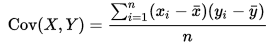
The second week looks into measures of association, most notable covariance and correlation. The covariance quantifies the relationship between 2 sets of data with an equal number of entries. For example the height and weight of persons could be considered. If it is positive, this means that when height increases, so does weight, and vice versa. Also, the unit of measure of the covariance is the product of the unit of measures of both data sets (being cm * kg). There are numerous ways to calculate the covariance with the typical one on the left, and a two pass version (summarized difference of entries with their mean) on the right since the left one would crash floating point arithmetic calculations used in computers in some cases.

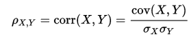
The covariance measure only indicates the direction of the relationship. Whatever the number, this has no bearing on the actual strength of the relationship. For this we introduce the correlation measure. This measure ranges from -1 to +1 and if it is either bigger than 0.5 or smaller than -0.5 we speak of a strong positive or negative relationship. The formula for this measure is the following with σx and σy being the standard deviation of their respective data sets:
Where covariance and correlation are measures of association, there is also causation. It is only briefly touched in the class by stating the need for correlation and a temporal distinction between both data sets as prerequisites. It is also important to check that other variables are not having an impact on the data sets which might render the causation determination a false positive.
One way to weed out false positives is to employ strong correlation metric (as opposed to the mathematical or weak correlation), introduced by Vincent Granville (Data Science Central). He calls this a synthetic metric: a metric designed to solve a problem rather than be crafted for its mathematical properties. It is a metric empirically derived from experience. This metric was specifically designed to detect false correlations in big data sets, and is based on the bumpiness of the individual data sets being similar, which is the similarity in their pattern or correlogram.
The strong correlation metric (r) of two data sets X and Y is calculated as such:
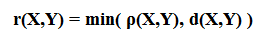
- with ρ(X,Y) being the standard or weak correlation
- with the d-correlation specified as such: d(X,Y) = exp { -a *| ln( cl(X) / cl(Y) ) | }
- the cl-function is the lag-1 autocorrelation of respectively the X data set and the Y data set
- the a-parameter takes on value 0 for weak correlation and value 1 for strong correlation.
It can even take on a higher value if the need is there to prove a stronger correlation.
For the remainder of the course, whenever there is mention of probability, it will be the Long Run Frequencies notion of probability. In this context, the following definitions are presented:
- Probability: A numerical measure of the frequency of occurrence of an event.
- Random Experiment: any situation wherein a process leads to more than one possible outcome.
- Random Variable: A variable that takes on values, determined by the outcome of a random experiment.
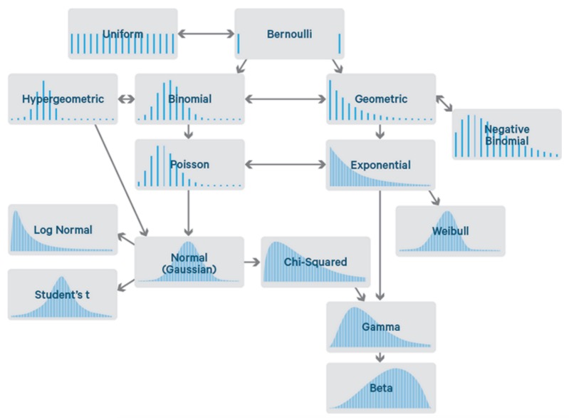
When taking the stance that a business processes is a random experiment with an associated random variable, we want characterize the variations in the random variable, by using something called statistical distributions. Statistical distributions are a tool to model the behavior of the random variable in order to make predictions towards the future. Some common distributions are beta, t-, gamma, Poisson, binomial, normal, … distributions of which the last three mentioned are the ones to be examined in detail in this course. There are two categories of distributions based on the type of data they apply to: discrete and continuous data. The difference between these two types of data is that entries in a discrete data set can only take a finite number of outcomes between two realizations, while continuous can have an infinite number of outcomes.
Sean Owen over at Data Science Central made a nice visual overview of the most common distributions as seen below.
Business Statistics and Analysis (week 3)10th of Januari 2017 |
|
Week 3 dives into the particularities of the normal distribution. Although this is a continuous distribution, it is often also used to approximate discrete data as well. It is the best known distribution with a curve shaped like a bell. This curve is generated by plotting the Probability Density Function (PDF) of the distribution.
The Probability Density Function is a function that maps probabilities to various possible values that a random variable takes when it is being approximated by a particular statistical continuous distribution. When it is a discrete distribution, we speak of a Probability Mass Function (PMF). For example, when rolling a six-sided die, the PMF for result 1 would be 1/6. The PDF works with ranges, as the probability of a result being an exact result when an infinite number of results are possible, is always zero. The probability of a range is determined by the area of the plotted curve defined by the curve, the X-axis, and the projection of both range indicators from the X-axis onto that curve.
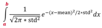
The normal distribution is uniquely determined by two parameters: the location (determined by the mean) and the spread (determined by the standard deviation). The probability for any range in the continuous data set can be determined by calculating the integral of the PDF (with the range boundaries):
Outliers for a normal distribution are a bit trickier than before, as this is a parametric distribution plot. Outliers in such a plot are to be identified based on the probability of the occurrence of a value, in other words how far the value deviates from the mean. Typically, values less/more than 3 times the standard deviation from the mean are classified as outliers.
The rest of the week is fleshing out an example in Excel with the appropriate functions related to the normal distribution. As with previous weeks, this teaching by example is fine but takes up too much of the time of the course devoted to just that. I would have preferred to go more into the details and practicalities of this type of distribution.
Business Statistics and Analysis (week 4)2nd of Februari 2017 |
|
In the final week of the course, the teacher works out some applications for these distributions. However, before these practical uses can be started, the concept of the standard normal distribution is introduced. This Is a normal distribution with a mean of 0 and a standard deviation of 1.Amongst other characteristics, any normal deviation can be transformed into a standard normal deviation by manipulating the dataset.
Other concepts to be understood are population and sample. A population is the complete set of numerical information on a particular quantity on which the analysis is focused. For example, if we want to infer the percentage of votes for a specific candidate in an election, the population would be the entire set of all people that are voting. A sample is a subset of a relevant population to make inferences about. Sampling is used because access to the entire population might not be possible, or it might not be practical or be very costly. A common way of sampling is random selection. Another possibility is the application of a Latin Square as I had to do for one of my previous projects.
The Central Limit Theorem allows us to infer the mean of a population based on the distribution of a sample taken from that population. The theorem boils down to the statement that any proper sample set taken from a population (irrespective of the nature of that population) will tend towards a normal distribution. For example, if we take the mean of several samples (each with n entries) taken from the same population, their means can be plotted around a normal distribution around the mean of the population with a standard deviation of the population divided by √n.
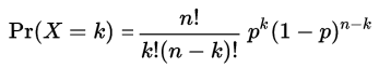
The binomial distribution is produced by repeated tries of the Bernoulli process: a Random experiment with a random variable that only has 2 mutually exclusive values. For example: if we define that success means rolling a 6 on a six-sided die, and all other results mean a failure, this is a Bernoulli process with “success” and “failed” as the possible values. A coin toss is another example. Since the binomial distribution is a discrete distribution there is a Probability Mass Function, with the variables in this PMF as follows: k is the exact number of successes. n is the number of tries, p is the probability of success.
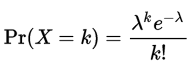
Next to the popular binomial distribution, for discrete data sets we can also use the Poisson distribution. This distribution is used to calculate the chances of any given number of events happening in a fixed time/space interval when the average number of events is known. This is calculated by the PMF as shown below, with k being the number of occurrences, and lambda being the average number of occurrences (or mean). For example, when the average number of customers per hour at a fast food restaurant is 30.5 (λ) and we want to know how likely it is that 25 customers (k) show up in any given hour, this gives us a probability of 65.11%.
As we can deduce from the formula, a Poisson distribution is uniquely defined by its mean (λ). It is also the distribution we use in the Queueing Theory for the Quantitative Analysis of business processes.
Conclusion2nd of Februari 2017 |
|
For me, the MOOC presented the concepts of basic analytics on a level that is too basic. However, I posit a quote by the Aberdeen Group about data sets: “Complexity is often best answered with simplicity”. What they mean is that simplicity drives analytical success: They found that organizations using a single, integrated solution were much more likely to improve organic revenue, operating profit and discoverable data in a repeatable fashion. And that complex data, if handled correctly, really drives business value. And in extension, that even simple analytical concepts applied to the data sets can already yield quite the beneficial information.
And thus, it did trigger me to dive into the field of data analytics and statistical methodology once again, so I am not considering the time I spent in this course to be in vain. While not the most efficient use of time, there was some value to me in this way.
| Review | BPM | EIM |